• Lack of clear and actionable CTAs, making user navigation and conversion paths unclear
• Visually similar UI elements that fail to create hierarchy or draw user attention to key actions
• Repetitive content across pages, leading to cognitive fatigue and reduced engagement
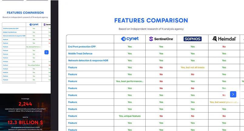
• Overloaded start screen with excessive data presented at once, overwhelming users and diluting key messages
• Bot widget occupies 25% of the desktop screen, disrupting layout and drawing attention away from core content
• Lack of clear and actionable CTAs, making user navigation and conversion paths unclear
• Visually similar UI elements that fail to create hierarchy or draw user attention to key actions
• Repetitive content across pages, leading to cognitive fatigue and reduced engagement
• Overloaded start screen with excessive data presented at once, overwhelming users and diluting key messages
• Bot widget occupies 25% of the desktop screen, disrupting layout and drawing attention away from core content

.webp)
.webp)
.webp)
.webp)
.webp)


